
29.7K
Downloads
199
Episodes
Creating Handmade Books and Writing Fiction in Kanazawa, Japan 金沢市
Episodes
Sunday Aug 27, 2017
Sunday Aug 27, 2017
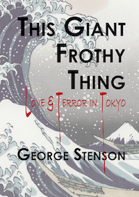
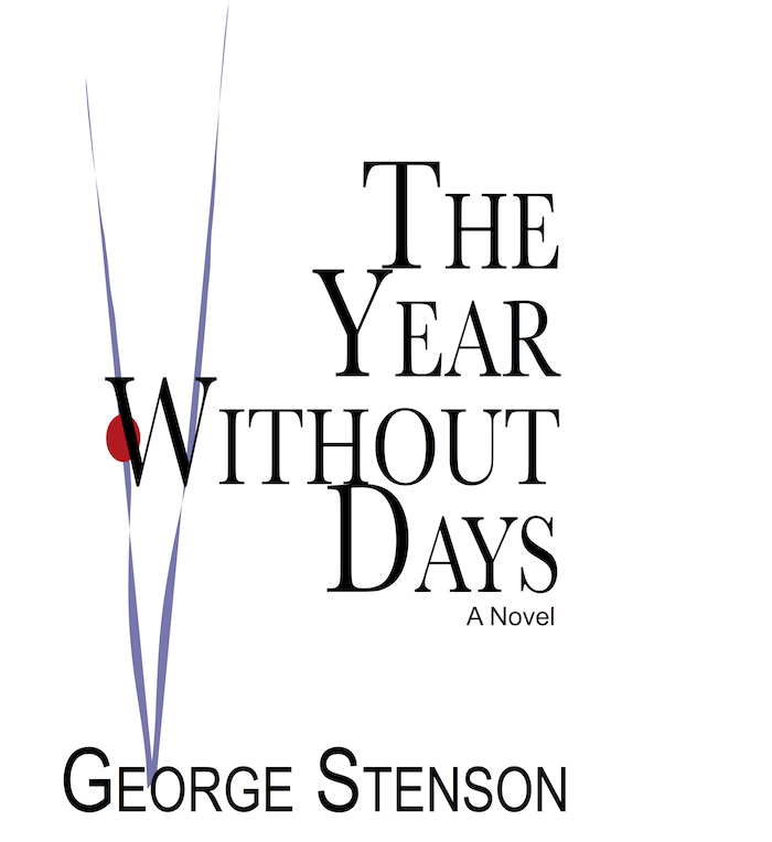 Here are two covers of two of my novels which may or may not be good. However, your project here is to determine if you like both, one, or neither and why. The first thing I noticed was the dimensions are not exact. Books need to be taller than they are wide and both appear to be too wide.
Here is something to consider. The purple V on The Year Without Days refers to the book being the fifth book in a pentology. The horizontal purple Roman 1 (one) on Botchan’s Bartender implies that it is the first book in the same pentology.
The little red dot is a reference to the fact that both books are part of my Japan Pentology: five books all some how related to Japan. Either the characters are Japanese (as in Botchan’s Bartender where all the characters are Japanese) or the location is in Japan (such as book two: The Nuns of Nañao. The characters in that book are Russians, mostly, but it takes place in the Soviet Union, the US, and Japan (Yokohama, mostly.)
Then there’s the added Japanese in Botchan’s Bartender which, translated, means The Murder of Botchan, or Botchan’s Murder. There are at least two murders in the novel and perhaps Botchan - a Japanese term now meaning a little spoiled rich kid or a kid who is trying to look grown up - a junior high school kid in a suit, for example. Originally it was from Natsume Soseki’s novel Botchan.
 The point of the red dot from the Japanese flag and the Japanese on some of the novels including Giapan - ジパン is to show that the books are part of that Japan Pentology. Hopefully they might be easier to market. If I could figure out the genre. Later, I’ll give you all a synopsis and you can clue me into to the synposis. Although Botchan’s Bartender is part mystery/detective.
I also see that I need a black border to separate the whiteness of the book cover from the whiteness of the page. Or maybe a darker cover - off-white paper? But the point is to keep it as minimal as possible.
We shall see.
Friday Aug 11, 2017
Friday Aug 11, 2017
 Covers are important. Both on beds and books. On books they are used to judge the entire content of the book. Imagine strolling through a bookstore where all the books have the same dull borwn and white covers. Only the titles and authors are different. How could we choose a book? The people who make book covers are talented creative people. Their talent and creativity, however, come at a price that first time self-publishers may not be able to afford. How do first time self-publishers (which used to be called vanity publishing) come up with covers?
Like me, they do it themselves. Like many self-creating book cover people, I have neither the creativity nor the talent to produce a good cover for my books. Nor the cash to pay a competent book cover designer. If I get the money to pay for a good designer (some designers get up to and maybe more than $2,000 a cover.), I will be more than willing to pay for a good cover.
On the Authority Self Publishing podcast they mention that authors should find a book cover designer who is familiar with the author’s genre. I realize you don’t want a romance novel cover on a murder mystery novel or a fantasy cover on a technical manual. But what if your genre is less specific. I’m talking about Literary Fiction, whatever that means. From Nanowrimo discussions, I can assume that Literary Fiction means not being in a specific genre that is easily identifiable such as fantasy or romance, mystery, thriller, or western. Or even historical fiction. The Great Gatsby? What’s the genre for that little tome? What about Moby Dick or Infinite Jest or House of Leaves?
 I’m definitely not comparing myself to any of those authors but I do worry about what genre I belong to, if I belong to one. And if I don’t belong to a genre or sub-genre, how can I explain to the book cover designer what I need? Does the designer have to read the book? What if the designer doesn’t like my style? Or can’t read English?
Despite reading in all the book cover designer websites, such as The Book Designer, all of which say the first and biggest mistake any self-publishing author can make is to make their own covers, I did. Here are two.
The name of the novel is
This Giant Frothy Thing: Love and Terror in Tokyo.
I have two questions for you.
- Which cover do you prefer, even if you don’t know the content?
- What does each cover say about the content of the novel